Spotify Case Study
Role: UX Designer
Timeline: 8 weeks
Tools: Figma
Project Type: Academic
Project Overview
As part of my Master’s in UX Design program at MICA, I was tasked with creating two new features within an existing digital product. I was responsible for each phase of the project, from conducting user research via interviews, creating wireframes and prototypes, determining the overall design direction of the project, and orchestrating usability tests.
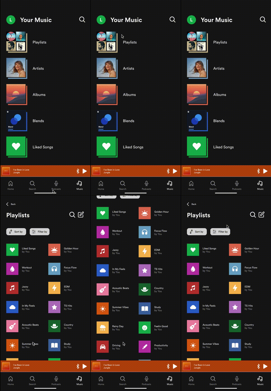
Two features I believe can be improved on Spotify’s mobile app are the organization of playlists and liked songs. The current organization is ineffective and unintuitive. It takes users too many steps not only to edit Playlists and Liked Songs, but also to locate each of these categories within the Library tab.
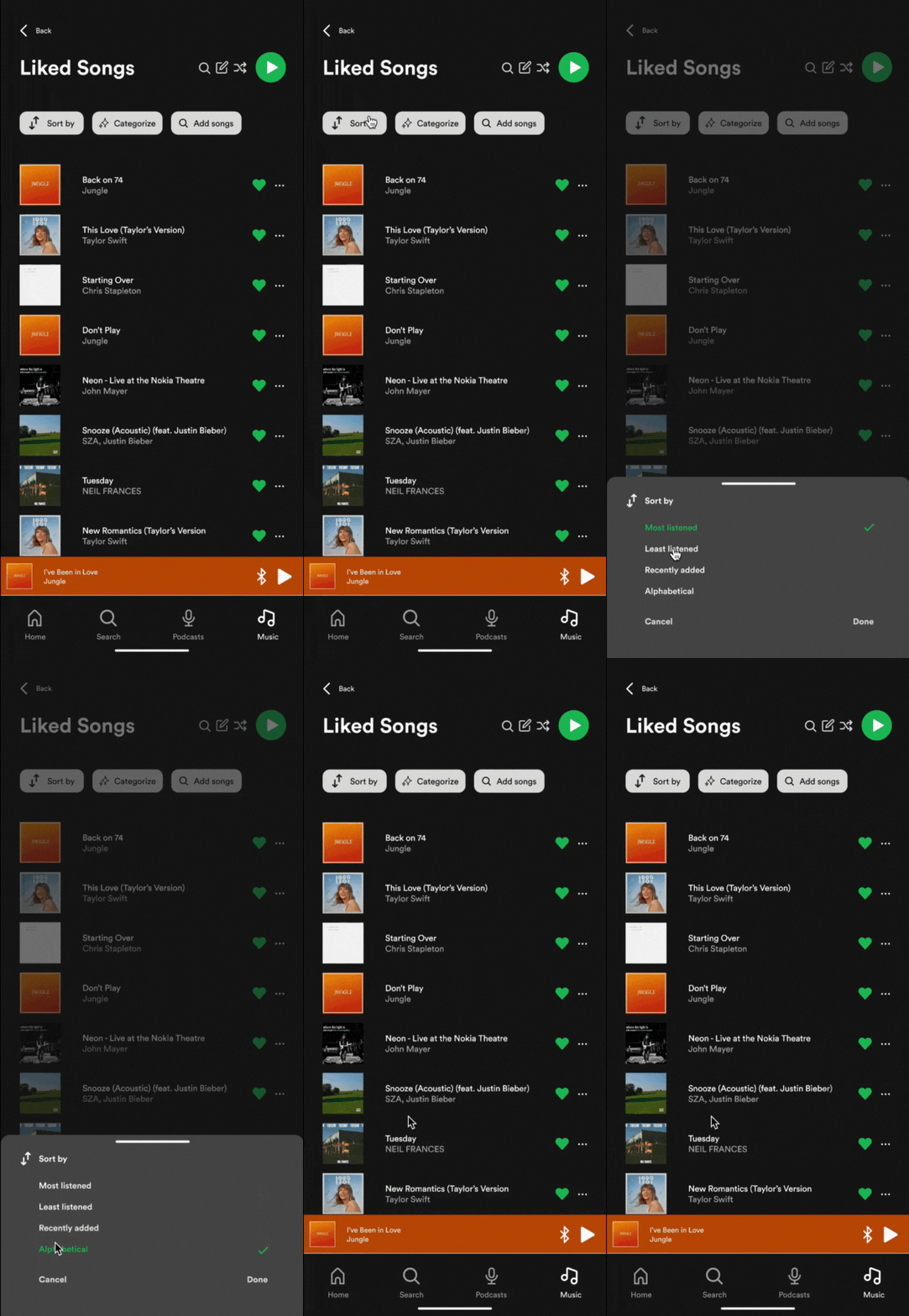
My goal was to simplify both of these processes by creating two features that would organize a user’s Playlists in a quick and intuitive way, and organize a user’s Liked Songs into different categories for them to choose from. I also wanted to divide the current Library tab into two sections, Music and Podcasts, to further streamline the organization and help users locate what they were looking for more quickly.
Challenges included staying in line with the UX / UI and design systems Spotify already has in place, while coming up with two unique features that were innovative. It was key to solve pain points that users currently encounter in the Spotify mobile app through these features.
“How might we help Spotify listeners quickly decide what music to listen to?”
Users
User 1: The Passionate Playlister
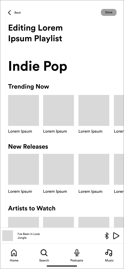
As an organized music listener, I want to edit my Playlists efficiently, so I can listen to specific types of music depending on my mood.
![User Journey 1]()
As an organized music listener, I want to edit my Playlists efficiently, so I can listen to specific types of music depending on my mood.

User 2: The Liked Songs Lover
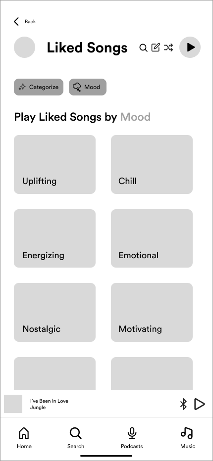
As a listener who doesn’t organize their songs into playlists, I want my Liked Songs to be more organized, so I can listen to music I’ll enjoy.
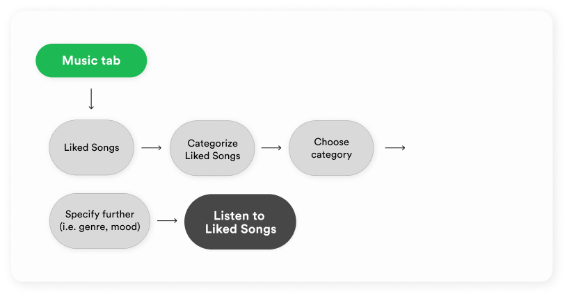
![User Journey 2]()
As a listener who doesn’t organize their songs into playlists, I want my Liked Songs to be more organized, so I can listen to music I’ll enjoy.
Design System
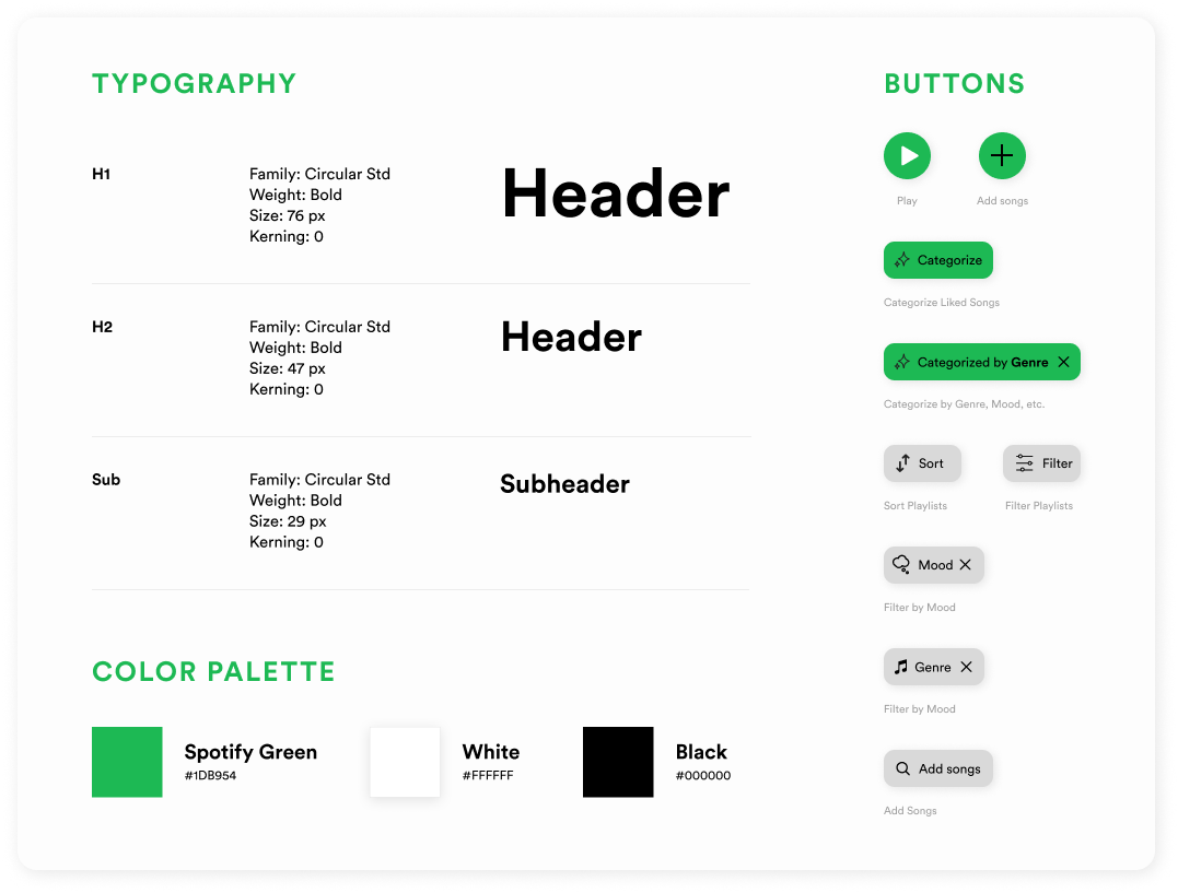
The Spotify brand revolves around three core principles: relevance, human elements, and a unified look and feel. They prioritize creating personalized experiences for users, avoiding a one-size-fits-all approach to remain relevant. While being highly technological, they also value incorporating human emotion, steering clear of overly technical or clever designs.
They seek to be consistent in their approach rather than reinventing the wheel in order to build brand trust and recognition with their audience. With this knowledge of the core principles, it was key to build the design system around these values. It was vital to keep the core color palette and typography styles Spotify utilizes and stay true to the brand design while implementing my own components and styles.
Feature 1 - Filtering Playlists


Feature 2 - Categorizing Liked Songs




Testing Plan
I organized two rounds of testing to gauge the usability of the features I was creating. I conducted five individual usability tests with users who were all familiar with Spotify. I tested my mid-fidelity prototype with each user in order to gain a better of perception of my users’ current Spotify experience as well as their experience filtering Playlists and categorizing Liked Songs. The first round of testing revealed that users expressed varying preferences for organizing their music, with some favoring the Liked Songs feature and others preferring the Playlist filtering feature based on their listening habits.
100% of users agreed they’d use one or the other in order to make their process of choosing their music more efficient. Users’ suggestions for improvement included reordering filters for relevance and refining the Add Songs feature. Next steps consisted of implementing user suggestions and conducting another round of testing for additional feedback.
“I love this feature because my music is constantly changing. This is a very quick, nice way to make it more user-centric.” -Participant
“I love this feature because my music is constantly changing. This is a very quick, nice way to make it more user-centric.” -Participant
Iterations
After a second round of testing, 100% of users agreed they would utilize either the Filter Playlists or the Categorize Liked Songs feature in addition to the new method for adding songs to playlists. Users appreciated the clarity of the filtering options, particularly the ability to navigate backwards through subcategories. 100% of users agreed the addition of the plus sign icon for adding songs was more intuitive, and several users also appreciated visual confirmation through checkmark animations and a pop-up screen once songs had been added to a user’s playlist.
Users suggested adding in a "Recommended Songs" section and renaming categories when it came to sorting Liked Songs. Other recommendations included increasing body copy sizing for readability, adding a confirmation popup screen, potentially renaming the "Categorize" button to "Filter," and reordering categories based on user preferences. To avoid confusion in the end, I left the Categorize feature named as-is to keep the features somewhat independent from one another.

Results
After two rounds of testing, iterating, and making design updates, I was able to finalize two fully functional, high-fidelity prototypes demonstrating each of the two features I created in addition to some other flows where I expanded upon my initial goals of streamlining the Spotify mobile experience for users. Based on the research I conducted, I’m confident these features would actually improve users’ Spotify experiences and make users’ processes of deciding what to listen to more efficient and intuitive.
In terms of next steps, ideally I’ll continue my research in this area by delving further into more sections of the Spotify mobile app to continue streamlining the experience. Although I briefly touched on the information architecture and how the mobile app is organized by separating Music & Podcasts into different tabs within this project, I’d like to expand upon this and find ways to improve the content within the Home and Search tabs as well.